GRID
LESS
BUILDER.js – ver.1.3.23
Web Editing Without Grid Constraints
GridlessBuilder.js is a Javascript library for building responsive content without grid constraints. It makes a web page become more like a canvas where you can place blocks anywhere on it, freely arrange them, align, scale, rotate, shape and more.


Absolute Positioning Made Responsive
Absolute positioning normally won’t produce responsive content (even using %, vw/vh), and so, until now, grid system is considered to be the ideal framework used by modern builders. If not, the tool will force users to do a major rework to target different screen sizes. But this is not the case anymore with GridlessBuilder.js. Read More: Back to the Simplicity of Absolute Positioning
Move, Scale, Rotate, Shape & More
GridlessBuilder.js allows blocks to be highly adjustable. Even a slider can be re-shaped. Things that are only possible in a prototyping tool now made available in a production-ready tool with GridlessBuilder.js – no coding required.


Build Responsive Content with Freedom
For the first time, developing reponsive content with canvas flexibility is now made possible. The Gridless approach that comes with GridlessBuilder.js handles block overlaps, alignments, and all related issues to make the content look great on different screen sizes, with no (or minimum) adjustments required.

Mobile adjustment when you need it
While responsive is made automatic, GridlessBuilder.js still allows you to make adjustments when necessary (such as on dimension, spaces, font size, visibility, etc). You can switch to tablet or mobile editing view and make the ajustments.


Sample designs created with GridlessBuilder.js


Articles or writings don’t have to be the same or look like regular BLOG posts. You have the freedom to make them just like a magazine:


And there is still more..
Multi-layer Canvas
A section can contain multi-layer canvas or slides. Each layer/slide has the same flexibility as a normal section and act as a canvas for you to freely add blocks. You can then turn them into a slideshow! Furthermore, you can apply animation on each block, making it a cool presentation to feature your products or stories.

See the big picture!
You can zoom your workspace to see the overall look of your page – yes, without leaving the editing mode! Unlike most editors (only edit the actual page size), GridlessBuilder.js allows you to choose your preferred size to work with and your page won’t be blocked by the main panel.

Switch theme anytime you want
Choose your prefered theme to work with, light or dark, with a single click.

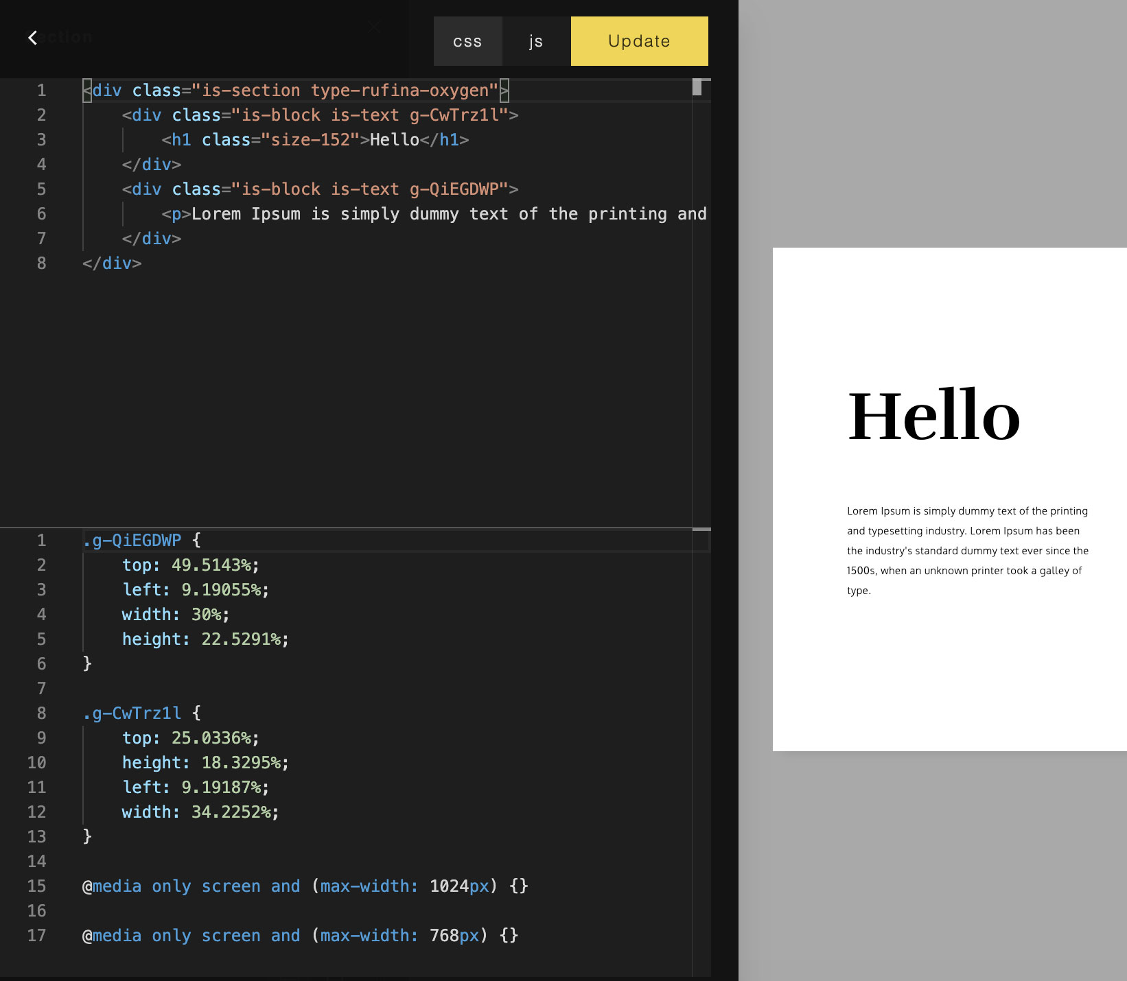
Understandable HTML & CSS
Clean HTML code is generated, and most importantly: understandable! You will get probably the most simple HTML structure (with less DIVs) from a web page that contains rich content or visually complex layout. For developers, this means easy to read & customize.
A separate stylesheet is also generated and both can be edited if needed. GridlessBuilder.js will return both HTML and the stylesheet for you to save in your application.
The code editor also allows you to navigate the blocks visually, to help you check which class belongs to each block and vice versa.
Built for CMS or SaaS projects, for startups and their clients.
GridlessBuilder.js is written in pure Javascript (ES6) and created to be used in CMS applications or multi-user SaaS projects. You can create your own CMS, powered with GridlessBuilder.js, or host an online web building service for commercial purposes, allowing users to build their own websites.

Usage
Examples of usage in simple HTML, PHP, React and Vue projects are included in the package. Here is the simple usage example:
Include the required js:
<script src="path/gridlessbuilder.min.js"></script>
Include the required styesheets (gridless css and the builder css):
<link href="path/gridless.css" rel="stylesheet" type="text/css" />
<link href="path/gridlessbuilder.css" rel="stylesheet" type="text/css" />
Then, initialize using:
var builder = new GridlessBuilder({
     wrapper: '.is-wrapper'
});
This will make content inside <div class=”is-wrapper”> become editable.
To get the edited HTML content and its styles, use:
var html = builder.html();
var styles = builder.styles();
The content and stylesheet can then be submitted or saved in a database (depending on your custom application).
Requirements
- Content generated can be viewed in all modern browsers with HTML5 specification.
- For editing only, we recommend the latest Chrome, Firefox, Safari, or Edge.
GridlessBuilder.js is a client-side javascript. However, for saving images on the server, a server-side script is needed. Examples in PHP and NodeJS for saving images are provided. You can also create your own handler depending on your server-side environment.
About | Privacy | Delivery & Return
Copyright © 2021 Insite Mitra Inovindo. All Rights Reserved.